

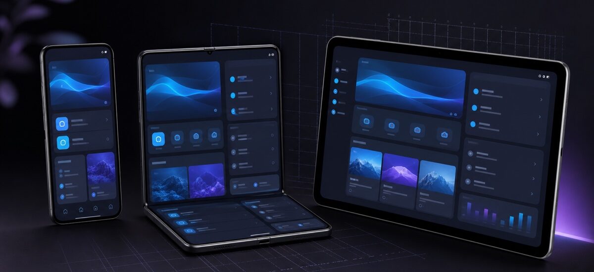
“Phone layout” and “tablet layout” are no longer reliable design targets. The same app can run in portrait, landscape, split screen, a foldable posture, or a resizable desktop window. Hardware labels tell you less than the space currently available to your UI.
An adaptive Compose architecture should respond to the window, preserve user context during resizing, and keep navigation predictable as panes appear or disappear.
Start from content relationships
Before choosing APIs, describe what the screen means. A message list and selected conversation form a list-detail relationship. An editor and its formatting controls form a supporting-pane relationship. A discovery surface may be a feed.
These relationships survive across form factors:
- On a compact window, list and detail usually appear one at a time.
- On a wider window, they can appear side by side.
- On a foldable, panes may need to respect a hinge or tabletop posture.
Model the navigation state once, then let the layout decide how many destinations are visible.
Keep the window decision at the screen boundary
Do not scatter width checks through every component. Choose the high-level layout near the route or screen boundary and pass ordinary data and events into reusable content.
@Composable
fun InboxRoute(
uiState: InboxUiState,
onMessageSelected: (MessageId) -> Unit,
) {
val adaptiveInfo = currentWindowAdaptiveInfo()
InboxScreen(
uiState = uiState,
adaptiveInfo = adaptiveInfo,
onMessageSelected = onMessageSelected,
)
}
The exact adaptive scaffold depends on your Material 3 Adaptive version and navigation setup, but the ownership rule remains useful: window information selects presentation; the state holder owns application state.
Preserve selection and scroll state
When a compact layout expands into two panes, users should not lose their selected item. When it contracts again, the detail destination should remain reachable through Back. Keep selected IDs in saveable or state-holder state, not inside the temporary pane implementation.
Use stable keys for lists, and be deliberate about rememberSaveable. A window resize is a presentation change, not a reason to reload data or recreate the ViewModel.
Let navigation adapt with the content
A bottom navigation bar can become a navigation rail when width increases. The important part is that destinations and selection semantics remain consistent. Adaptive navigation should not feel like a second application.
Material 3 Adaptive provides scaffolds and navigation building blocks for common patterns. Prefer those established behaviors before building a custom pane coordinator. Custom logic is justified when the product interaction truly differs, not merely because the screen is wide.
Test transitions, not only snapshots
A layout can look correct at 400 dp and 900 dp but fail while moving between them. Test:
- continuous resizing and orientation changes;
- compact-to-expanded transitions with an item selected;
- fold and unfold events;
- large font scales and translated text;
- keyboard, mouse, and accessibility focus order;
- Back behavior when one or two panes are visible.
A successful adaptive UI preserves task continuity. More space should reveal useful context, not reset the task.